If you’re thinking about developing or upgrading a mobile app for your company, you can start with some design work to help you get momentum behind the project or flesh out the requirements.
Andrew Greenstein, SF AppWorks' CEO, breaks down the thinking and strategy behind 5 different app designs. Learn more about the differences between Skeumorphism and Neumorphism, flat design, accessible designs, and incorporating hardware elements of the phone into the design.
Here's a great quick watch for anyone designing or developing an app.
5 App Designs to Look at:
SportMe Marathon Trainer
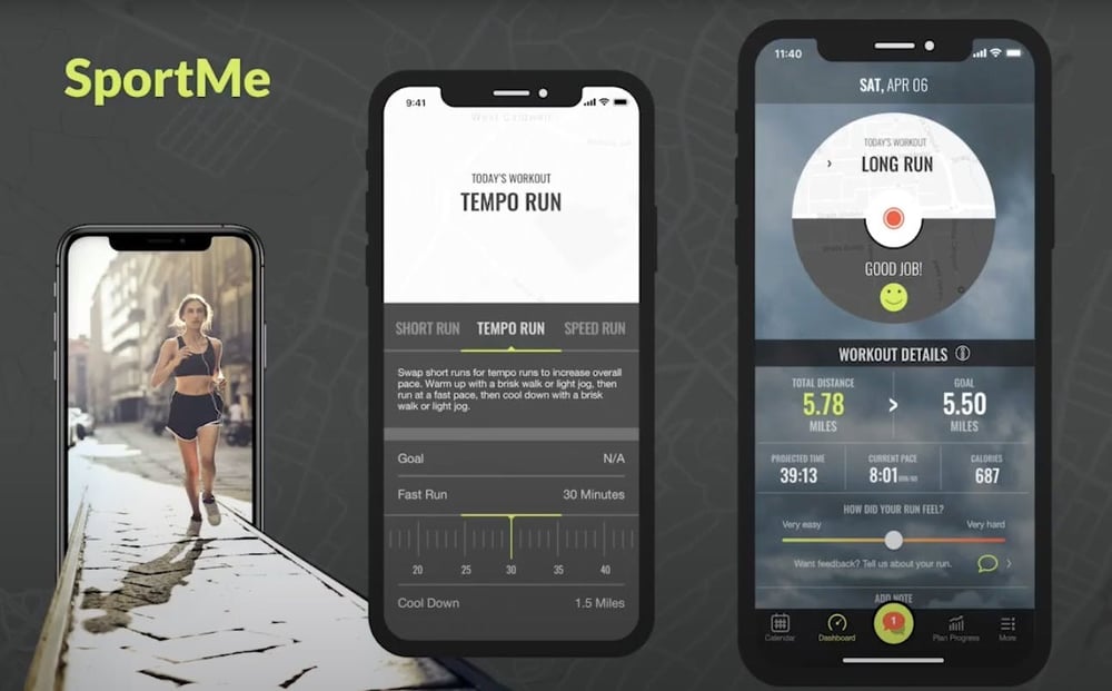
Let's start with SportMe, a marathon training and tracking application. We designed the interface back in 2013, after the emergence of iOS 7. Skeumorphism, or the design practice of making digital objects resemble their physical counterparts, was all the rage in iOS6. We wanted to break with that design style and embrace the newer, flat design that was hallmark of the new iOS 7 operating system.
Related: Top 10 Most Successful Apps of 2020 And What You Can Learn From Them
Cross Trainer
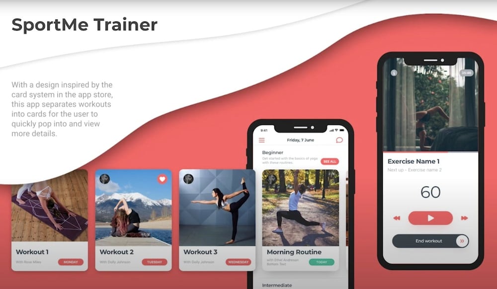
A few years later we came back with a follow up - a home workout app. We based our design on the card system from the App Store, which had just been redesigned and relaunched, to give users a sense of familiarity while browsing for workouts (as opposed to browsing for apps). We also took a page from the emotional design playbook by incorporating inspiring photography to empower and motivate users to self-improve.
PushApp Tracker
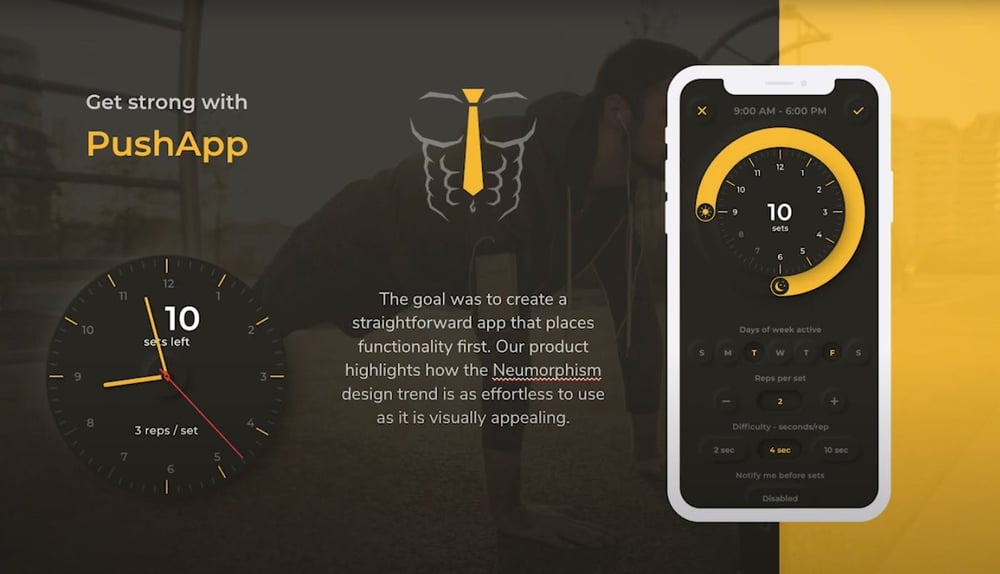
Fast forward to 2020, flat designs are fading and neumorphism, a relatively new design trend, is getting a lot of buzz. Like skeuomorphism, it takes real life objects as its inspiration, but it ditches the hyper-realism and complexity and instead incorporates principles of minimalism and cleanliness. Neumorphic UI elements use soft shadows and rounded edges to look like they are subtly growing out of the background. Our Pushapp tracker perfectly illustrates this trend.
Related: The Pushapp Strength in Minutes
Homeworkology
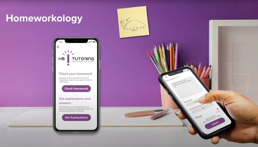
Next up we have Homeworkology, a simple app used by students to check or get explanations on their homework.
This accessible UI mitigates distractions for users. Following the introduction of the notch on iPhone X, the design utilizes the extra screen space to not feel as constricting as Instagram. At the time, it was new and bold. Nowadays, it’s totally standard.
Cool Read: Redis vs MongoDB: Which One Should You Choose?
First 5k
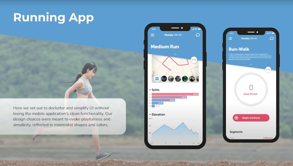
The simple (and thus) aptly titled “running app” is a total exercise in minimalism, which is always a good idea in software design. To stand out in a crowded field of running apps loaded with functionality, we designed an uber simple experience with uber simple design elements and soft tones. Because there are only two modes - run tracking, and dashboard, we wanted to experiment with a unique navigation choice - the diagonal line across the dashboard that can be expanded acts as a partition between details and dashboard. Because it breaks paralleling, it catches the users attention and notifies them that it is an important element.
Get a Free Copy of 'Mobile App Development Checklist'
Shoot a message at andrew@sfappworks.com if you have questions or would like a quote, or just to talk shop. As a progressive digital agency specializing in web and app development, we live, eat, and breathe this stuff and love talking about it.
Related: What is Rapid Prototyping


COMMENTS