The protagonist of our design sprint case study is Insidesource, an innovative workplace design firm that creates customized office environments for companies like Facebook and LinkedIn, was looking for ways to automate portions of the furniture selection process for their clients.
They had a few ideas of what a digital platform might do, but needed help refining, shaping, and testing those ideas. For situations like this, we use a process pioneered by Google and used by many successful startups and organizations - The Design Sprint.
Over the course of one week, a company can use a Design Sprint to tackle big problems through a series of design thinking exercises that help conceptualize, ideate, prototype, and test new products.
A Five-Day Design Sprint (Case Study): Insidesource
Design Sprints require a facilitator who has gone through the process and can guide the activities and keep the team focused and on track. For this design sprint, I was the facilitator. I also brought two designers from my team to help with the competitive research, the ideating, and most importantly, the prototyping.
From the client-side, Design Sprints require a multi-disciplinary sprint team of no more than seven and a handful of experts from the company who understand the vision, the customer research, how things work in the organization, and what previous efforts have been undertaken. The sprint team should plan to be distraction-free for six hours per day during the sprint.
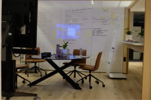
Whiteboards, sticky notes, snacks, and a creative space to hunker down and create are also required. We rotated between Insidesource’s beautifully designed San Francisco headquarters and our innovation space in San Francisco’s Mission District.
Design Sprint: Day 1 Morning
The first step in problem solving is understanding the shape and scope of the problem. The Design Sprint kicks off with an open discussion around the long term goals of the company, so after brief introductions and a quick outline of our week ahead, we dove in. We discussed ways to differentiate Insidesource’s offering to clients, reduce errors in the procurement process, stay relevant in a rapidly changing ecosystem, establish more recurring business, and improve and automate overall processes. By the end of the discussion, we had settled on a simple and direct long term goal: to improve how we purchase furniture. This goal was narrow enough to guide our exploration, yet broad enough to explore different ideas and problem points in the overall process. For the rest of the week, it would be our North Star.
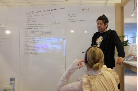
With our goal set, we moved on to a sobering, but important discussion of our fears, listing them on the whiteboard as we went along: what if we don’t differentiate? What if what we build doesn’t make sense? What if it doesn’t work with our existing systems? What if it’s more complex than the current process?
While it can feel intimidating to expose your biggest concerns upfront, it gives the team the opportunity to turn concerns into opportunities by reframing them: “What if we don’t” ⟶ becomes ⟶ “How do we?”
How do we differentiate our pitch; build a platform that makes sense; build something that is self-explanatory and less complex than the current process?
Monday Afternoon
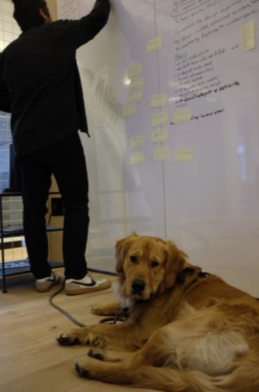
After a lunch break, we regrouped for another important step in the information intake process: Expert Interviews. We scheduled 30 minute interviews with a diverse set of perspectives from within Insidesource, including the COO and multiple members from the sales, marketing, operations, and client success teams. Absorbing so much information in such a short period of time can be grueling. To maximize information intake, we used a note taking device called How Might We. Each of us watched the interviews and recorded statements and notes, paying attention to pain points and areas of improvement.
Afterwards, we regrouped and listed every interesting observation on a card, then wrote HMW (How Might We) on the corner of the card. If the observation was “The furniture purchasing process is way too manual and time consuming”, we would write down “How Might We reduce the need to enter information by hand?”. Through this process, we converted pages of notes into clear action items.
As a final step, we used blue sticky dots to prioritize our interview feedback. Each person was allotted a set number of dots to be placed next to the HMW note that represented the greatest opportunity. After the votes were tallied, we placed dots on the whiteboard near correlating steps on the user map.
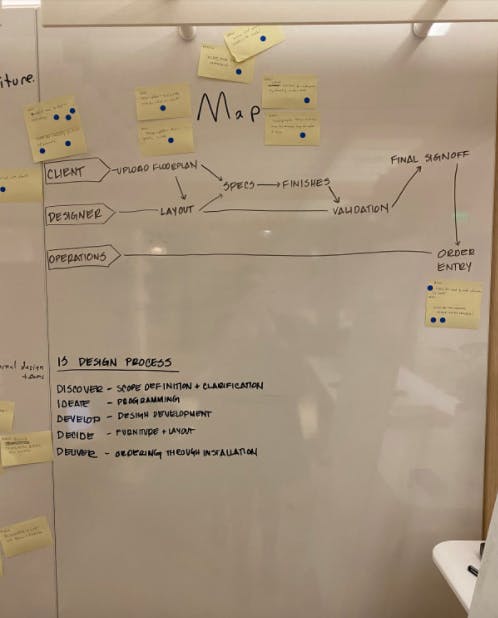
As day one came to a close, we looked over our whiteboards and marveled at our progress. We had selected a long term goal, identified our potential points of failures, talked to several people from the company with unique and interesting perspectives, catalogued and prioritized that data, and created a visual representation of how customers interact with Insidesource and where the opportunities for improvement exist within that map. In the words of the philosopher Ice Cube, it was a good day.
Tuesday Morning
Our main goal for Tuesday was to understand the competitive landscape and to start sketching ideas. In the morning, we started with an exercise called Lightning Demos. Each person spent a few hours on their own researching different solutions and ideas from their industry, and a few from other industries. We looked at room planning tools from Ikea and Amazon, and design management platforms from companies like Houzz. We even looked at project management tools like Trello.
Each person presented a 3-minute demo of their research. As a group, we discussed and notated the interesting features of each demo. We also took a few minutes to update (again) our user maps.
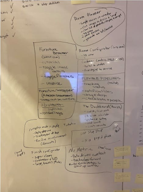
We loved the way West Elm’s room planner toggled image details and finishes, and how clean and well organized their invoicing function was. Amazon Showroom had a unique way of swapping out furniture options in a predesigned room, which we thought we could borrow for 3D modeling. We also loved how Trello manages status tracking, notifications, and checklists, all with a nice drag and drop functionality. Ideas were starting to flow and we were excited about it. Time to sketch.
Get a Free Copy of 'What to Expect from A clickable Prototype?'
.png?width=579&name=clickable%20prototype%20form%20cover%20(5).png)
Tuesday Afternoon
Tuesday afternoon marked the transition from research and knowledge gathering to ideation and creation. We had plenty of information. We circled the point of our user maps that represented the greatest opportunity. Now we needed to put ideas on paper.
Brainstorming can be difficult and frustrating, but a Design Sprint gives you an easy to follow four-step process:
Notes
For 20 minutes, each person walked around the room and gathered notes from the user maps, the fears, the lightning demos, and the HMW statements.
Ideas
For 20 more minutes, we privately jotted down some rough ideas and circled our favorites.
Crazy 8s
We each folded a sheet of paper into eight boxes. Then we spent one minute on each frame, sketching a variation of our ideas. The pace is frenetic. There’s no time to doubt or consider; you just draw.
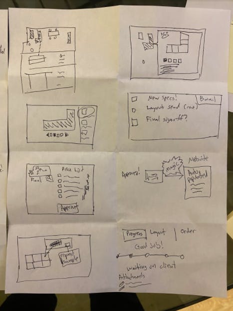
Solution Sketches
We spent the next hour sketching our solutions onto post-its. Each solution contained three boxes and a complete idea. The sketches need to be self-explanatory, so words matter and an entire user experience must be captured.
Take a look below - can you understand the concept behind this sketch?
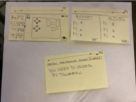
Once we finished our sketches, we put them in a pile and called it a day.
Wednesday Morning
After two days, we had covered a lot of ground. We had gathered a ton of knowledge through research and interviews, broken that knowledge down into actionable components, familiarized ourselves with existing solutions, explored a ton of ideas, and whittled those ideas down into a handful of thoughtful solution sketches. It was time to decide what we were going to prototype.
We used a five-step process to choose the strongest solution. First, we pinned our solution sketches on walls (and computer screens). Then we distributed stickers and each person walked around the room, studied the solution sketches, and placed the stickers next to the components of each idea that they liked.
Related: Working With Ambiguity
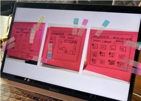
Next, we discussed each sketch as a group, all the while capturing standout ideas and objections. After the discussions, each person placed another sticker next to their favorite solution. Then the “Supervote” stickers were passed out to the deciders. They went around the room and studied each sketch along with the heatmap stickers and the votes. Then they placed their Supervotes on the winning idea.
But we also made sure to write down all of the features that we loved from the other sketches so that we could try and incorporate them into our prototype.
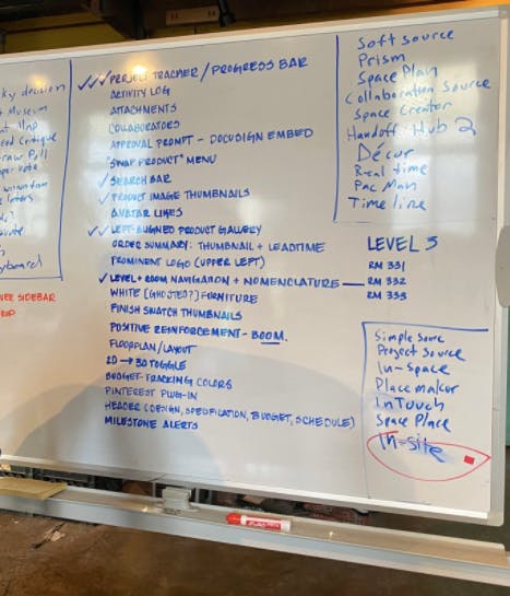
Wednesday Afternoon
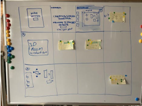
We regrouped for storyboarding. At this point we were really considering what the prototype was going to look like and how we were going to present it to users. We started at the beginning - the first time our users would see the product - which we gathered would be in the form of an email invitation. We drew 12 boxes on the white board and started mapping out each step of the user journey. The user would receive an email invitation, which they would click on. They would be taken to a welcome screen, followed by a layout of a building with furniture options on the left. From there, we fleshed out the concept.
When it started to get too complex, we moved into Google Slides.
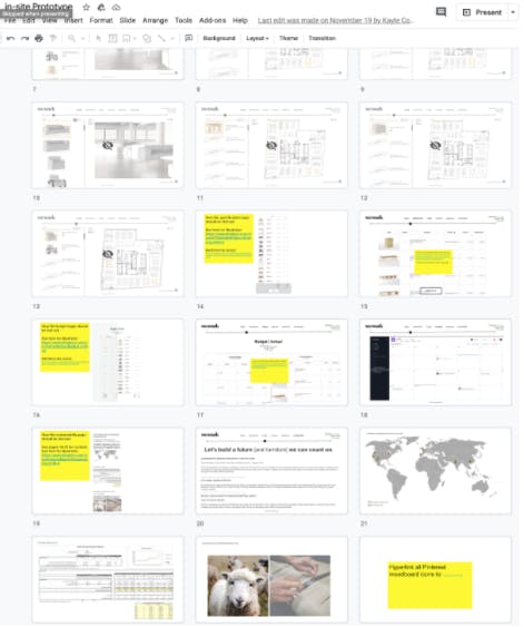
We worked late into the night, and when we were happy with the overall flow, we handed our storyboards over to our design team to turn those storyboards into an interactive clickable prototype.
Thursday
Lots. Of. Design. And words. And details. And decisions. And stitching things together. Until we got to this:
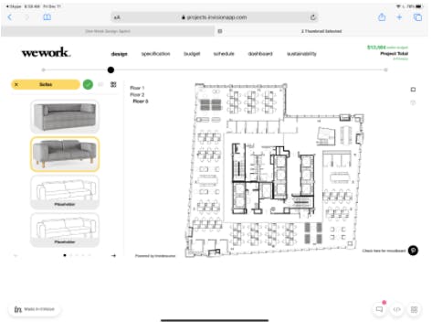
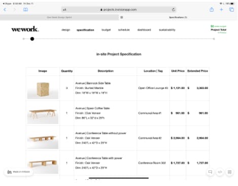
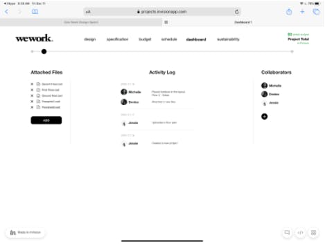
On Thursday we took our insights and goals from day one, our research and ideation from day two, and our decision making and storyboarding from day three, and we turned them into a clickable, interactive prototype.
We prepared a script for user interviews, which we had scheduled for Friday, and we went through a few practice runs. We were ready to test our prototype.
Related: Using One-Week Design Sprints to Prototype New Ideas
Friday
A design sprint is a super condensed product development cycle that culminates in real user testing at the end of a single week. Many people talk about doing user testing in product development, but few actually do. But when they do, they realize just how insightful user testing can be.
We scheduled interviews with four people who had extensive day-to-day experience in the space design process. Each interview was scheduled for 45 minutes. As the facilitator, I led the interviews while the sprint team took color-coded notes (black for neutral, red for negative feedback, blue for positive feedback).
A Design Sprint Case Study: User Testing
We asked each interviewer a few questions about their roles at their respective companies and what tools and processes they used to manage the furniture selection and procurement process. Then we asked them to share their screens and provided them with a link to the clickable prototype.
We asked them to explain what they were looking at. Then we asked them to interact with the prototype. Whenever they clicked something, we asked them what that click did. When they got stuck, we nudged them in the right direction. At the end, we asked them to describe the product to a friend, and we asked them what magic features they would add.
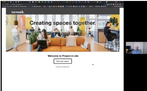
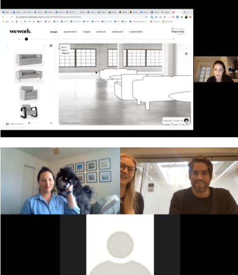
When we finished with the interviews, we drew a grid on the white board with each user’s name and each section of the prototype. Then we placed the feedback on the board, stood back, and marveled at the emerging patterns.
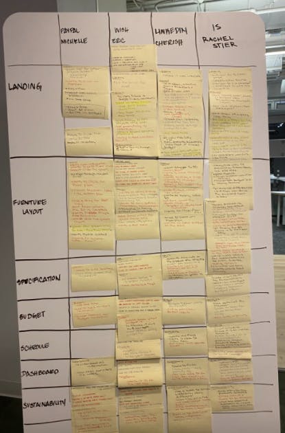
Users wanted drag and drop functionality. They wanted to be able to shift perspective in 3D and fly through the space. They thought the budget screen was confusing but important, and wanted the sustainability page to be tied to the furniture selections.
They loved the dashboard. They repeatedly used the words “one-stop-shop”, and remarked on how nice it would be to have a home for all of the documents and assets that are passed around by email. They loved that non-designers would be able to easily understand and participate in the furniture selection process. They felt that a tool like this could reduce errors and speed up the process.
They also exposed big user issues that were really easy design fixes at this stage, but could have cost weeks or months of development down the road. Our progress bar, for example, looked like a zoom bar. And a few suggested that we incorporate sustainability scores into the furniture selection panels.
We reviewed the feedback, presented the results to the rest of the team, and drew conclusions on our next steps.
In just one week, we had methodically created a user-tested digital product development plan. We had completed a Design Sprint.
Watch this dramatization on situations when businesses don't do rapid prototyping:
.png?%20White%20Bake%20Sale%20Promotion%20Facebook%20Post%20(4).png&width=290&name=Simple%20Pink%20%26%20White%20Bake%20Sale%20Promotion%20Facebook%20Post%20(4).png?%20White%20Bake%20Sale%20Promotion%20Facebook%20Post%20(4).png)



COMMENTS