Last month we launched a new website which, for a company that makes websites, is kind of an interesting exercise. On the one hand, a weak website can deter potential clients. On the other, spending vast resources on a presentation website cuts against our core belief that companies should only use technology to solve problems when it is, in fact, useful.
THE BIG FOUR WEBSITE CONSIDERATIONS
When you build a website you have a lot of options. Picking the right option depends on four big considerations: goal, content, traffic, and budget. Our goal was simple – we had to get off of Hubspot. The platform was clunky and slow to develop upon, and we decided it would be more cost-effective to stitch together our own marketing automation platform from various plugins and platforms. However, stitching those components together would require a level of customization, so template website builders like Squarespace were out.
Our Hubspot subscription expired in two months, so first and foremost we needed to quickly setup a place to park all of our existing content without losing our SEO rank. Content-wise, we planned to continue documenting our agency experience with weekly blog posts, monthly case studies, videos, infographics, and ebooks. That meant we needed a CMS, so custom HTML/CSS and progressive web apps were off the table.
Traffic was not a big concern – even when we were featured by TechCrunch for winning the Disrupt London Hackathon, we only saw about 500 visitors in a day, a far cry from the 10,000 concurrent users we had to support when our clients were featured on Dr. Phil and Oprah. The lack of high traffic expectations made Wordpress an attractive option.
Hubspot cost us $7,000/year and we expected our new website to last for 2 years, so $14,000 was the most we could justify spending. Adding all of these factors up, we decided to build our website on Wordpress, a solid option for presentation websites because it finds the middle ground between customization and cost.
OUT OF YOUR WAY DESIGN
With the platform picked, it came time to design. As a creative agency, our own marketing materials need to be subdued. If we have a really fun or quirky website, we might discourage clients who desire a more professional or serious look and feel. We decided we wanted something clean and filled with white space. We also decided the focus of our website should also reflect what we consider to be our greatest asset – our team. So we staged our own photoshoot and splattered real team-photos across our website.
As on homage to one of our clients, a leading company in the GIF-sharing space, we added GIFs where icons could go. They would disagree with our use of GIFS (to them GIFS are about conveying feelings), but we love how it gives life to portions of the page.
We decided to split our content into two buckets: Showcase and Resources. Showcase would be a place where we featured our work through case studies and videos. Due to the sensitivity of our client work, we’re often not able to openly discuss our projects, but we got a few clients to agree to open up and we’re working to convince others. The juicy details are behind an email wall anyway (nothing is free right?).
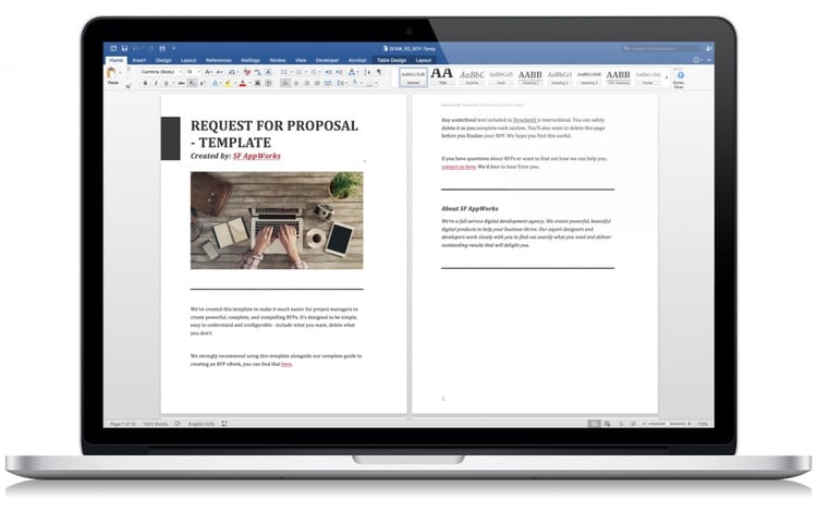
Resources are things like templates, ebooks, and checklists – DIY guides compiled from our years of experience. Writing an RFP? Start with our Request for Proposal Template, for example.

IT'S ALL ABOUT THE TEAM, REALLY
My absolute favorite part of our website is the team page. Check it out. We use GIFs to animate expressions and let everyone pick a quote that they resonated with.

THE RECIPE
Start with Wordpress. Install carefully. Add Google Analytics for tracking and analytics. Integrate Zopim to chat with users. Buffer to schedule social media posts. Sendgrid to manage transactional emails and marketing campaigns. Yoast for SEO optimization. Nginx to serve assets. W3 to cache assets for faster loading. Twitter Boostrap as a front-end framework for faster, smoother animations and Google Fonts API for fonts.
We hope you enjoyed our tour. If you have any feedback on the website, the content, or our posts, please don’t hesitate to reach out. You can find me at Andrew@sfappworks.com.

.png?%20White%20Bake%20Sale%20Promotion%20Facebook%20Post%20(4).png&width=290&name=Simple%20Pink%20%26%20White%20Bake%20Sale%20Promotion%20Facebook%20Post%20(4).png?%20White%20Bake%20Sale%20Promotion%20Facebook%20Post%20(4).png)

COMMENTS